Okay, I finished the "sketch" of the new bench design. "Sketch", because I didn't actually draw it - it's more of a photo shop type deal. I started with a photograph of a bench that I liked, but it wasn't quite right. I decided to try an experiment with the computer; it was fun, and frustrating too.
First, I cut the bench out of the original picture - fairly sloppy, as I was none too sure this would even work:
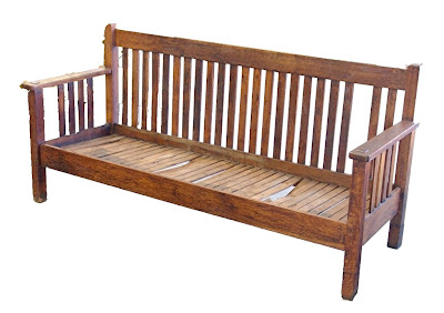
Then I did the following to get the first version of the sketch:
1. Made "repairs" to the bench - missing back slat etc...
2. Transformed to B&W - just thought it would look better this way...
3. Cut a chunk out of the middle of the bench to shorten the overall length.
4. Merged the remaining pieces back into one bench - you can still see the "scar" if you look closely, it's particularly easy to spot in the bottom slats...
5. Reconfigured the back and side slats. Basically, every two slats where joined into one wider slat - so 14 back slats became the 7 in the final design.
6. Ran a "pencil sketch" filter to make the image more sketch like; this also helped to blend the changes/additions into a more uniform whole.
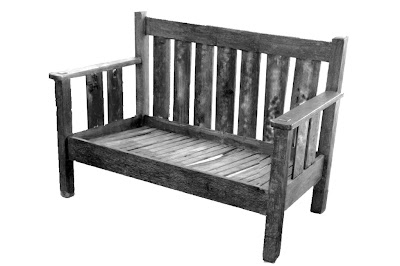
Of course the bench will need a cushion, so for the second version I did the following:
1. Created a virtual cushion for the bench.
2. Shaded the cushion for more of a 3D effect.
3. Applied a texture filter to give the cushion a more realistic surface.
4. Applied the same "pencil sketch" filter to the cushion so it would look like it belonged in same sketch as the rest of the bench - well, sort of...
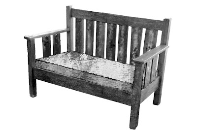
Now I need to work up some measurements from the images, make adjustments as required, and get to work!




Very cool Dan! I like the "new" design with the wider slats. Are you adding storage to the seat like the old bench?
ReplyDeleteBob - Thanks! There are no plans now to include storage, but as things continue to mutate, I'll work it in if it seems feasible.
ReplyDeleteHey, Dan, great stuff.
ReplyDeleteNow that you "mastered" Photoshop, give his sister, Illustrator, a go. It is a little different working in vector but there are huge advantages. The main one is the ability to draw to scale, or even full size (if its no more than 220 inches), making it worth the struggle to learn it. Also, vectors scale up where bitmaps don't.
I'll put a post together over the next couple of days explaining how to make a template in Illustrator. You may find it helpful.
I truly enjoy your blog.
Peace, man,
Mitchell
Mitchell - thanks for the tip on Illustrator. I look forward to seeing your post on that. I'm glad you are enjoying the blog.
ReplyDelete